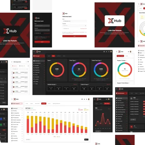
Building the Future with Innovative Software
We specialize in developing software, mobile applications, and AI solutions to empower businesses with technological innovation.
We specialize in developing software, mobile applications, and AI solutions to empower businesses with technological innovation.
Meet the dedicated experts passionately driving exceptional software solutions.
At EXEDITEC , we are masters in transforming your ideas into digital realities. Our expertise lies in creating top-notch software products tailored to a variety of business models. Our dedicated team of developers and designers works relentlessly to deliver innovative and customized solutions that propel your business forward. We are committed to excellence and innovation in every project. Our mission is to blend technology and creativity, providing you with solutions that not only meet but exceed your expectations. Trust us to take your business to the next level in the digital realm!
Develop sophisticated web applications to elevate your online presence. Our web software solutions are designed for scalability, security, and customization to meet your unique business requirements. We build responsive and feature-rich web applications that deliver exceptional user experiences and help you reach your digital objectives.
Leverage the power of artificial intelligence to optimize operations, automate tasks, and deliver customized experiences. Our AI solutions are crafted to drive innovation, enhance efficiency, and provide your business with a competitive edge. Whether it’s machine learning, natural language processing, or predictive analytics, we ensures seamless integrations.
Explore our comprehensive suite of services tailored to fulfill your specific business needs.
Create tailored mobile applications designed to deliver smooth user experiences and boost customer interaction. Our team excels in developing intuitive apps for both iOS and Android platforms with effortless precision. We guarantee that your mobile app aligns with your business objectives and integrates seamlessly with your systems.
Boost your online presence with our specialized marketing and SEO strategies. We assist in increasing your visibility, attracting more traffic, and turning leads into dedicated customers. Our services encompass keyword optimization, data positioning, content marketing, social media management, and more, all designed to enhance your digital footprint.

businessies
users
applications